Playwright Accessibility Testing: What axe and Lighthouse Miss
axe and Lighthouse miss 60–70% of WCAG violations. Learn the limitations of automated accessibility testing and how to write smarter Playwright tests.
Automated accessibility tools like axe, Lighthouse, and Playwright's @axe-core/playwright integration only catch an estimated 30–40% of real WCAG violations. That gap is dangerous in an environment where developers are already suffering tool fatigue managing a queue of linters, security scanners, and CI checks competing for attention. When an AI assistant suggests a fix that turns a failing accessibility check green, it's tempting to accept it and move on — the fix looks reasonable, the build passes, and the queue gets shorter.
But greening the scanner isn't the same as fixing the problem. AI-suggested fixes are generated from patterns. Consequently, they may satisfy the scanner without addressing the underlying accessibility intent. Manual accessibility testing and context awareness are still essential to verify that detected violations aren't false positives, that proposed fixes are appropriate for the actual context, and to catch the 60–70% of accessibility bugs that automated tools never surface at all.
Automated Accessibility Testing Coverage: What the Research Shows
This isn't a criticism of axe (Deque), WAVE (WebAIM), or the tools that leverage their engine like Lighthouse and Playwright. The vendors themselves and independent research agree: there are structural limits to what any automated engine can evaluate. The exact figures vary across sources, but the conclusion is consistent:
| Source | Finding |
|---|---|
| WebAIM | ~30% of real WCAG failures are detectable by automation |
| W3C / WAI | ~20–30% of WCAG Success Criteria are fully automatable |
| U.S. GSA – Section 508 Program | Some materials state 1 in 3 issues are caught by automated accessibility tests |
| Deque (axe) | 57.38% of known violations detected when axe-core was run against a large sample of real-world audited pages |
| Accessible.org | 13% fully automatable, 45% partially, 42% not automatable (WCAG 2.2 AA) |
Deque arrived at the 57.38% figure by taking a more pragmatic, real-world approach rather than a theoretical one. They sampled a large number of sites and measured how many of the actual documented accessibility defects would have been detected using axe-core. This is good news: in a practical sense, automated accessibility tools find a higher percentage of reported defects than the theoretical estimates suggest. However, even with this optimistic approach, it shows a 43% gap — proving you still need a mix of both manual and automated testing.
Guided manual accessibility audits — also called semi-automated testing, or Intelligent Guided Testing (IGT) in Deque's platform — sit between fully manual and fully automated testing, narrowing the coverage gap. Some estimates put coverage as high as 80% with this approach. Guided audits are typically a premium service that uses AI and machine learning to filter what automation can handle, then provides a structured checklist to walk the tester through the remaining checks that still require human judgment.
What Automated Accessibility Tools Reliably Detect
Before covering the limitations and gaps let's acknowledge what automated tool checks are good at so we know when to use them to complement accessibility testing.
Automated tools reliably catch mechanical rule violations:
- Missing
altattributes on images - Missing form labels
- Insufficient color contrast ratios on static text
- Missing
langattribute on<html> - Missing document title
- Invalid ARIA roles and attribute values
These are structural checks — things that can be evaluated by reading the DOM without understanding intent or context. They're also exactly the kind of thing that's easy to accidentally break in a refactor.
Regression prevention is where automated checks earn their place in a CI pipeline. Accessibility defects don't announce themselves the way functional bugs do. A UI change that removes an aria-label, breaks focus order, or drops a landmark region won't throw an error or cause a visual test failure without an explicit check. A Playwright accessibility scan catches these silently introduced regressions before they ship — something a periodic manual review will inevitably miss between cycles.
Surface area at scale is the other advantage. A Playwright accessibility scan covers every page in your test suite on every CI run. A thorough manual pass takes hours and realistically happens infrequently. Automated checks don't replace the manual pass — they cover ground at a speed and scale no manual accessibility audit can match.
The goal isn't to position automated and manual testing against each other. Each contributes something the other can't. Automated checks are the always-on floor; manual review is the deeper, periodic pass that catches what automation is structurally unable to evaluate.
What Automated Accessibility Checks Can't Evaluate
1. Ambiguous Link Text
Links like Read more, Click here, Browse all, and Learn more all pass automated checks without complaint. There's nothing structurally wrong with them — they're valid anchor elements with text content.
The problem is context. Screen reader users frequently navigate a page by tabbing through links in isolation, without the surrounding paragraph to provide meaning. Hearing "read more" three times in a row tells you nothing about where each link goes.
Automated tools can't evaluate whether link text is meaningful — only whether it exists. A page full of "Read more" links passes axe just as cleanly as a page with fully descriptive link text.
Fix: Write descriptive link text that makes sense out of context — "Read more about Playwright accessibility testing" rather than "Read more." When that's not possible due to design constraints, use aria-label to provide the full context: aria-label="Read more about Playwright accessibility testing".
Fix (static analysis): For React projects, eslint-plugin-jsx-a11y includes a built-in anchor-ambiguous-text rule. For other stacks, ESLint accessibility plugins exist for Vue and HTML but may require a custom rule for this specific check — the Playwright test later in this article is the framework-agnostic alternative.
Later in this article, I'll show a Playwright test pattern to catch this in your UI tests — especially useful when link text is generated dynamically and static analysis can't reach it.
2. Missing Skip Navigation Links
Landmark elements like <main> and <nav> satisfy axe's bypass-block check (WCAG 2.4.1). The rule is technically met — there's a mechanism to skip repeated content.
But keyboard-only users who don't use a screen reader still tab through every item in the header before reaching the main content. Landmarks help screen reader users jump between regions; they don't help a keyboard user skip a 12-item navigation menu on every page load.
A skip link — a visually hidden anchor as the first focusable element that jumps to #main-content — serves both groups. Landmarks alone don't.
Fix: Add a skip link as the first focusable element on every page, even if your landmark structure is correct.
<a href="#main-content" class="sr-only focus:not-sr-only">
  Skip to main content
</a>
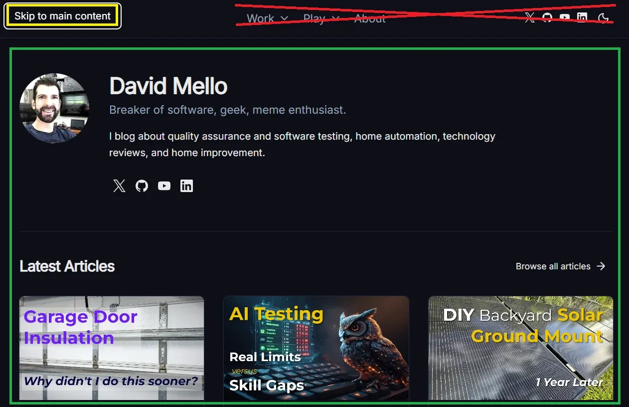
Below is a screenshot showing how it works on this site. When a keyboard-only user visits, the first focusable element is a Skip to main content link that jumps them directly to the main body — saving them from pressing Tab 9 times to cycle through the header elements (crossed out in red) and social links before reaching the page's main content (highlighted in green).
3. aria-labelledby vs aria-label — Both Pass, One Is Better
Both aria-labelledby and aria-label satisfy automated checks equally. The accessibility tools verify presence and valid syntax — they don't evaluate which approach is more appropriate for your context.
aria-label strings are invisible — they exist only in the accessibility tree. This creates two problems:
- For sighted users who also use assistive technology, there can be a mismatch between what they see and what their screen reader announces
- Translation tools frequently miss
aria-labelattributes, leaving non-English users with untranslated accessible names
When a visible heading or label already exists on the page, aria-labelledby pointing to that element is almost always the better choice — it reuses the visible text so both representations stay in sync automatically.
<body>
  <!-- A visible header exists with text to label the section with, so aria-labelledby is correct here -->
  <section aria-labelledby="aria-header">
    <h2 id="aria-header">Using aria attributes correctly</h2>
    <p>...</p>
  </section>
</body>
<!-- No visible label text exists, so aria-label is appropriate -->
<button aria-label="Close dialog">
  <svg aria-hidden="true">...</svg>
</button>
Fix: Prefer aria-labelledby when a visible text element can serve as the label. Reserve aria-label for cases where no visible text exists.
4. Static ARIA Labels on Dynamic Controls
A toggle button with aria-label="Switch to dark mode" passes automated checks regardless of the current state. The label is present and well-formed — but if the page is already in dark mode, the label is factually wrong. It should read "Switch to light mode."
Automated tools check presence and format, not accuracy or correctness over time. A static label on a stateful control is invisible to a scanner.
Fix: Bind aria-label dynamically to reflect the current state:
:aria-label="isDark ? 'Switch to light mode' : 'Switch to dark mode'"
Later in this article, I'll show a Playwright test that verifies a toggle's aria-label updates after interaction — catching stale labels before they ship.
5. Low Quality Alt Text and ARIA Labels Automated Tools Can't Detect
axe-core validates presence and format. It does not validate quality.
aria-label="nav", aria-label="section 1", and alt="image" all pass automated checks. So does role="button" on a <div> that isn't keyboard focusable. A screen reader user hearing "image" or "section 1" is no better off than they were before the attribute was added — in some cases they're worse off because the presence of the attribute signals to the developer that the defect has been addressed.
The same trap applies to landmarks: adding aria-label satisfies the rule, but a bad label is as useless as no label at all. Automated tools cannot ask "does this label actually help someone who cannot see the page?" That question requires a human.
The same principle extends to image alt text. alt="logo" on a company logo passes axe — but says nothing useful. The correct alt text depends on context that automation can't evaluate:
<!-- Standalone logo — identify the brand -->
<img src="logo.svg" alt="Acme Corp" />

<!-- Logo as a link — describe the destination, not the image -->
<a href="/">
  <img src="logo.svg" alt="Acme Corp — Home" />
</a>
Both pass axe equally. Only one communicates the right thing in each context.
Fix: Before adding any ARIA attribute, ask whether it communicates something meaningful to a user who can't see the visual context. If the answer is no, the attribute isn't a fix — it's noise. Apply the same question to alt text — describe the role the image plays on the page, not just what it depicts.
6. Accessibility Regressions Automated Checks Won't Catch
Let's imagine a developer reads the WCAG documentation, applies the correct fix for an issue, and later a linter or well-meaning colleague, not having read the same best practice, "fixes" the fix, thinking the first developer made a mistake.
Two examples that come up regularly:
alt="" is actually the correct attribute for decorative images. It explicitly tells screen readers to skip the element. A linter that flags missing alt text, or a developer who sees an empty alt and assumes it's an oversight, changes it to alt="decorative image". Now screen readers announce "decorative image" on every decorative element in the page — noise that wasn't there before.
aria-hidden="true" on icons inside labeled buttons is correct when the button's accessible name is provided by its visible text. Removing it and replacing it with aria-label="icon" passes tooling, but pollutes the accessible name computation and potentially overrides the button's actual label.
In both cases, a passing automated check actively masks a regression. The original state was more accessible than the "fixed" state.
Fix: Treat alt="" and aria-hidden="true" as intentional signals, not oversights. Add a comment explaining the intent so your team doesn't correct them:
<!-- Empty alt intentional: decorative image, screen readers should skip -->
<img src="divider.svg" alt="" />

<!-- aria-hidden intentional: button label provided by visible text -->
<button>
  <svg aria-hidden="true">...</svg>
  Submit
</button>
7. Automated WCAG Color Contrast Testing Limitations
Lighthouse and axe now catch contrast violations for standard text on solid backgrounds — this is a genuine improvement and one of the areas where automated tooling has meaningfully advanced.
But gaps remain:
- Text over images or gradients — axe-core may not be able to reliably report contrast issues when working with gradient or image backgrounds
- Semi-transparent backgrounds — the computed color may not be accurate
- Hover and focus states — the scan evaluates the element as it exists at scan time; insufficient contrast on focus rings or hover styles is invisible unless that state is active when the scan runs
- Dark mode — a scan in light mode won't catch dark mode contrast failures, and vice versa
Later in this article, I'll show Playwright tests that trigger hover, focus, and dark mode states before scanning — catching the contrast failures a default scan misses.
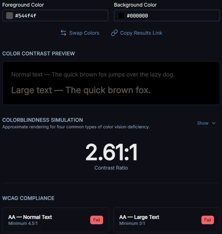
For the contrast issues automated tools do catch, a dedicated checker gives you more control than waiting for a CI scan. The WCAG Color Contrast Checker I built lets you test specific color pairs against AA and AAA thresholds, simulate how the combination appears across four types of colorblindness, and generate a ready-to-paste bug report including recommended closest-matching color fixes for your issue tracker.
For those harder-to-detect gradient issues, one approach to manually verify contrast over a gradient is to check against each end of the gradient. Given:
.hero-text {
  background: linear-gradient(to bottom, #ffffff, #000000);
  color: #544f4f;
}
Enter #544f4f as the foreground color and #ffffff as the background in the WCAG Color Contrast Checker, verify it passes, then repeat with #000000 as the background. For multi-stop gradients, check each color stop. If the text passes at every stop, it passes across the full gradient.
8. When Lighthouse Landmark Recommendations Break Legacy HTML
Lighthouse flags missing landmark regions as accessibility violations. In a modern HTML5 codebase that recommendation is straightforward — add <main>, <nav>, <header>.
In pre-HTML5 doctypes (XHTML strict, HTML 4.01 strict), those elements are invalid markup. Following the recommendation without understanding the doctype constraint produces markup that is simultaneously invalid and appears to satisfy the accessibility rule.
The correct fix in legacy markup contexts is ARIA landmark roles on <div> elements:
<div role="main">...</div>
<div role="navigation" aria-label="Main navigation">...</div>
Automated tools evaluate against an idealized modern HTML5 context. They have no awareness of your doctype constraints and cannot distinguish between "missing landmark" and "correctly implemented ARIA landmark role for a legacy codebase."
Fix: In pre-HTML5 contexts, use ARIA landmark roles rather than HTML5 landmark elements. In HTML5 codebases, use the native elements — they carry the landmark role implicitly and don't require the explicit role attribute.
9. Form Accessibility: Labels, Instructions, and Error Messages Automated Tools Miss
Automated tools reliably catch a missing <label> or a form field with no accessible name. What they can't evaluate is whether the label, instruction, or error message is actually useful.
A <label>First name</label> associated with a text input passes every automated check. So does <label>Field 1</label>. The tool sees a label — it doesn't read it.
The same gap extends across the full form experience:
- Placeholder text as the only instruction — placeholder text disappears when the user starts typing, leaving no reminder of what the field expects. Automated tools don't flag this pattern.
- Vague error messages — "Invalid input" and "Your email address must be in the format name@example.com" both pass automated checks. Only one helps the user recover.
- Error proximity — errors that appear only at the top of the page satisfy WCAG's error identification requirement but are disorienting for keyboard and screen reader users navigating a long form.
- Error announcement timing — whether an error is surfaced via
aria-liveoraria-describedbyin a way screen readers actually pick up requires testing with real assistive technology, not a DOM scan. - Required field indicators — a red asterisk is a visual convention. Without a text equivalent or
aria-required="true", screen reader users have no indication a field is mandatory until a failed submission tells them so.
Fix: Test every form manually with a keyboard and a real screen reader. Trigger error states deliberately — submit with empty required fields, enter invalid formats — and verify that the announced error tells you exactly what went wrong and what to do to correct it. Confirm that placeholder text is supplemented by a persistent visible label, not used as a substitute for one.
10. Keyboard Accessibility: Dynamic Content, Modals, and Interactive Components
Automated tools can verify that a modal has role="dialog" and an accessible name, or that an accordion button has aria-expanded. What they can't do is interact with those components the way a keyboard user would — to verify they actually behave correctly under navigation.
This is a structural limitation of static DOM scanning. A scanner evaluates the page as it loads — it doesn't click buttons, open dialogs, or press keys. It can confirm that a modal has the right ARIA attributes in the markup, but it has no way to verify what happens when a user actually opens it. That gap is exactly where Playwright earns its place: it can drive real keyboard interactions and assert on the result.
The most common failures in this area:
- Focus not moving to the modal on open — the dialog appears visually but keyboard focus stays behind it, leaving keyboard users stranded outside the content they need
- Focus not trapped inside the modal — Tab should cycle through focusable elements within the dialog; if it escapes into the page behind, keyboard users lose their place without realizing it
- No Escape to close — keyboard users expect Esc to dismiss a modal; relying solely on a close button forces them to Tab to find it
- Focus not returned on close — when a modal closes, focus should return to the element that triggered it; dropping focus elsewhere forces keyboard users to re-navigate from scratch
- Expand/collapse keyboard activation — an accordion that only responds to mouse clicks isn't keyboard accessible; Enter and Space should both activate toggle controls
- Dynamically added content not announced — content that appears after an interaction (search results, inline validation, notifications) needs
aria-liveregions or explicit focus management to reach screen reader users
Fix: Test every interactive component with keyboard only — no mouse. Open modals with Enter, navigate within them with Tab and Shift+Tab, close with Escape, and verify focus returns to the trigger. Activate expand/collapse controls with both Enter and Space and confirm the revealed content is reachable by Tab.
These keyboard paths can then be automated in Playwright:
test('modal traps focus and closes on Escape', async ({ page }) => {
  await page.goto('/');
  await page.getByRole('button', { name: 'Open dialog' }).click();
  const dialog = page.getByRole('dialog');
  await expect(dialog).toBeVisible();

  // Tab multiple times — focus should remain within the dialog
  for (let i = 0; i < 10; i++) {
    await page.keyboard.press('Tab');
    const isInsideDialog = await page.evaluate(() =>
      document.activeElement?.closest('[role="dialog"]') !== null,
    );
    expect(isInsideDialog).toBe(true);
  }

  // Escape should close the modal and it should no longer be visible
  await page.keyboard.press('Escape');
  await expect(dialog).not.toBeVisible();
});

test('modal returns focus to trigger on close', async ({ page }) => {
  await page.goto('/');
  const trigger = page.getByRole('button', { name: 'Open dialog' });
  await trigger.click();
  await page.keyboard.press('Escape');
  await expect(trigger).toBeFocused();
});

test('expand/collapse toggle is keyboard accessible', async ({ page }) => {
  await page.goto('/');
  const toggle = page.getByRole('button', { name: 'Show details' });
  const content = page.getByRole('region', { name: 'Show details' });

  await expect(toggle).toHaveAttribute('aria-expanded', 'false');
  await expect(content).not.toBeVisible();

  await toggle.press('Enter');
  await expect(toggle).toHaveAttribute('aria-expanded', 'true');
  await expect(content).toBeVisible();

  await toggle.press('Space');
  await expect(toggle).toHaveAttribute('aria-expanded', 'false');
  await expect(content).not.toBeVisible();
});
Writing Smarter Playwright Tests That Go Beyond a Lighthouse Report
The answer to these gaps isn't to abandon automated testing — it's to write tests that go further than a default axe pass or green circle in Chrome's Lighthouse Accessibility report. A standard AxeBuilder scan is the starting point, not the finish line.
These test patterns cover defects a default scan misses.
Default axe scan (your baseline)
import { test, expect } from '@playwright/test';
import AxeBuilder from '@axe-core/playwright';

test('accessibility scan', async ({ page }) => {
  await page.goto('/');
  const results = await new AxeBuilder({ page }).analyze();
  // Ensure the default page state has no violations
  expect(results.violations).toEqual([]);
});
Hover state contrast
A standard scan misses contrast issues that only appear on hover. Trigger the state first, then scan.
test('accessibility scan on hovered button', async ({ page }) => {
  await page.goto('/');
  // Trigger hover state on the button
  await page.getByRole('button', { name: 'Subscribe' }).hover();
  const results = await new AxeBuilder({ page }).analyze();
  // Verify with the button hovered we still have no violations present
  expect(results.violations).toEqual([]);
});
Focus state contrast
Same principle — trigger focus before scanning so axe evaluates the focused styles.
test('accessibility scan on focused button', async ({ page }) => {
  await page.goto('/');
  // Trigger focus state on the button
  await page.getByRole('button', { name: 'Subscribe' }).focus();
  const results = await new AxeBuilder({ page }).analyze();
  // Except no violations
  expect(results.violations).toEqual([]);
});
Dark mode contrast
Contrast issues may appear on light mode vs dark mode or vice-versa.
test('accessibility scan in dark mode', async ({ page }) => {
  await page.emulateMedia({ colorScheme: 'dark' });
  await page.goto('/');
  const results = await new AxeBuilder({ page }).analyze();
  expect(results.violations).toEqual([]);
});

test('accessibility scan in light mode', async ({ page }) => {
  await page.emulateMedia({ colorScheme: 'light' });
  await page.goto('/');
  const results = await new AxeBuilder({ page }).analyze();
  expect(results.violations).toEqual([]);
});
Skip link — first focusable element
Verify the skip link exists, is the first element reached by keyboard, and actually moves focus to the main content when activated.
test('first focusable element is a skip link that navigates to main content', async ({ page }) => {
  await page.goto('/');
  await page.keyboard.press('Tab');
  const focused = page.locator(':focus');
  await expect(focused).toHaveAttribute('href', '#main-content');
  await expect(focused).toHaveText('Skip to main content');

  // Activate the skip link and verify it navigated to main content
  await page.keyboard.press('Enter');
  await expect(page).toHaveURL(/#main-content$/);
});
Unique landmark labels
Catch duplicate landmark names (best practive to have programmatically unique landmarks)
test('all nav landmarks have unique accessible names', async ({ page }) => {
  await page.goto('/');
  const navs = await page.getByRole('navigation').all();
  const labels = await Promise.all(
    navs.map((nav) => nav.getAttribute('aria-label')),
  );

  // Verify every nav has a label
  labels.forEach((label, index) => {
    expect(label, `Navigation element ${index + 1} is missing an aria-label`).not.toBeNull();
  });

  // Verify all labels are unique
  const uniqueLabels = new Set(labels);
  expect(uniqueLabels.size).toBe(labels.length);
});
Ambiguous link text
Check for known offenders that pass structural validation but fail in context.
test('no ambiguous link text', async ({ page }) => {
  await page.goto('/');
  const ambiguous = ['read more', 'click here', 'browse all', 'learn more', 'here', 'more'];
  const links = await page.getByRole('link').all();
  for (const link of links) {
    const text = (await link.innerText()).toLowerCase().trim();
    expect(ambiguous, `Ambiguous link text found: "${text}"`).not.toContain(text);
  }
});
Dynamic aria-label on stateful controls
Verify that a toggle's accessible name reflects the action it will perform, not just that it changes after interaction. A color mode toggle in light mode should read "Switch to dark mode" — and once clicked, "Switch to light mode." A label that says "Switch to light mode" when the page is already in light mode is wrong/misleading.
test('color mode toggle label reflects current state', async ({ page }) => {
  // Start in light mode — toggle should offer to switch to dark
  await page.emulateMedia({ colorScheme: 'light' });
  await page.goto('/');
  const toggle = page.getByRole('button', { name: /switch to/i });
  await expect(toggle).toHaveAttribute('aria-label', 'Switch to dark mode');

  // After clicking, page is in dark mode — toggle should offer to switch to light
  await toggle.click();
  await expect(toggle).toHaveAttribute('aria-label', 'Switch to light mode');
});
Generic alt text
Catch alt text that was added to silence a linter but communicates nothing.
test('no generic alt text on images', async ({ page }) => {
  await page.goto('/');
  const genericAlts = ['image', 'photo', 'picture', 'icon', 'decorative image', 'banner', 'img'];
  const images = await page.locator('img[alt]').all();
  for (const img of images) {
    const alt = (await img.getAttribute('alt') ?? '').toLowerCase().trim();
    if (alt !== '') {
      // Empty alt is valid and intentional for decorative images — don't flag it
      expect(genericAlts, `Generic alt text found: "${alt}"`).not.toContain(alt);
    }
  }
});
Manual Accessibility Tests to Supplement Automated Tests
Some accessibility defects cannot be detected through test automation alone. Whether a label is meaningful vs. merely present, whether focus order feels logical to a real user, whether a screen reader announces content in a way that makes sense — these all require a human judgment call.
Use this checklist as part of your periodic accessibility audit — the checks automation structurally cannot perform:
- Tab through the full page with no mouse — does focus order make sense?
- Is a skip link the first focusable element?
- Are all landmark regions labeled and distinct?
- Does every link make sense read aloud out of context?
- Do dynamic controls update their accessible name when state changes?
- Do
aria-labelledbyreferences point to visible, accurate text? - Test with a real screen reader — NVDA (free, Windows), JAWS, or VoiceOver (built into macOS and iOS)
- Navigate by landmarks, headings, and links — not just linearly
Run the screen reader in a way that reflects how actual users navigate. Screen reader users may not read a page top to bottom. Instead, they may jump between headings, landmarks, and links to orient themselves. If that navigation doesn't make sense, the page isn't accessible regardless of what the automated scan says.
Conclusion
Automated accessibility tools like Lighthouse, axe, and Playwright tests (leveraging axe-core) are a floor, not a ceiling. Use them to catch mechanical violations quickly, run accessibility tests on every CI build to guard against regressions, and write tests that go beyond the default scan to cover the states and conditions a basic pass misses. Unlike functional bugs that break visible behavior, many accessibility defects are invisible to sighted developers — a stale aria-label, a dropped landmark, or a broken focus order leaves no visual trace and no failing test without an explicit check.
Think of them as a robot vacuum. They cover large areas automatically and pick up the dirt that accumulates between manual sessions, but you still need to manually vacuum the spots they can't reach.
Leverage automated tools as both a coverage floor and a regression backstop, freeing you to focus your manual testing time on the accessibility defects that require human judgment and real-user navigation.